Loading...
Platform UI Refresh
Problem Statement · As GetGround aims for product led growth by pivoting to a subscription based model, with AI enhanced features to support the end to end investment journey, the user platform is becoming an increasingly important part of our customer experience.
Many areas of the platform are the product of previous experiments and iterations, that are either out of date or need deprecating. The refresh aims to create a foundation for the next stage of GetGround by removing what is no longer needed, and bringing a cohesive design language and user experience to what will be kept and built on for the future.
Role · Lead Product Designer
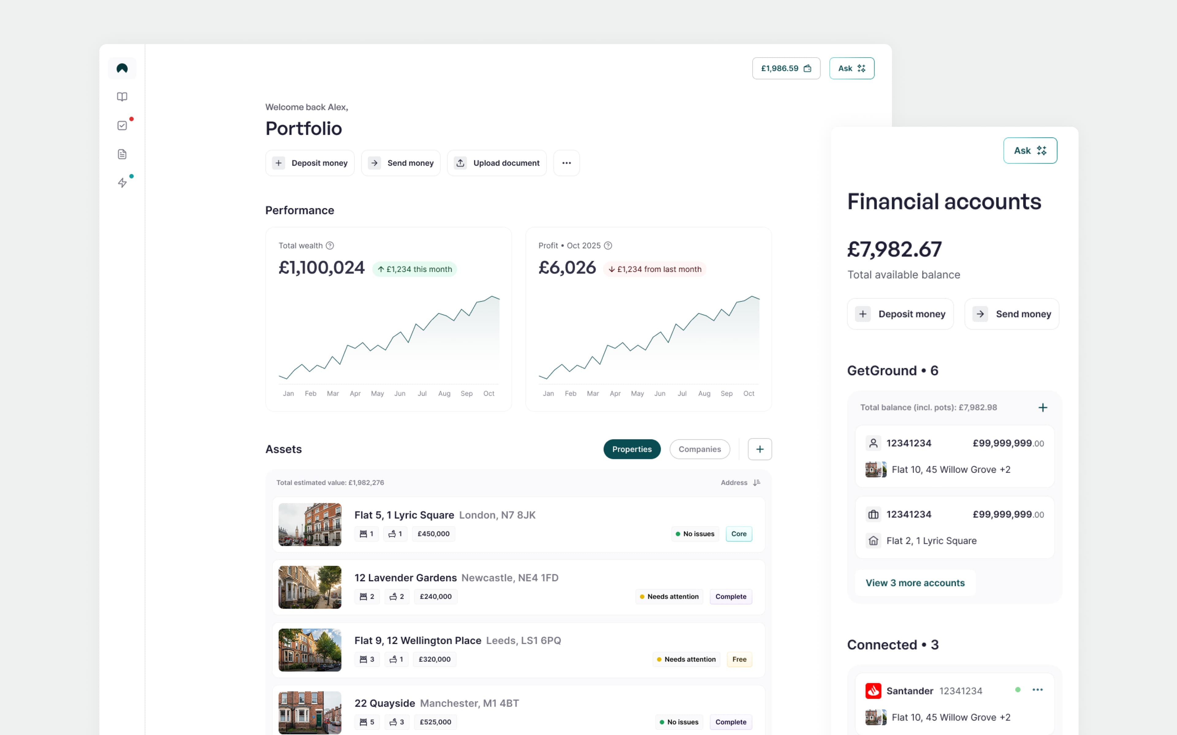
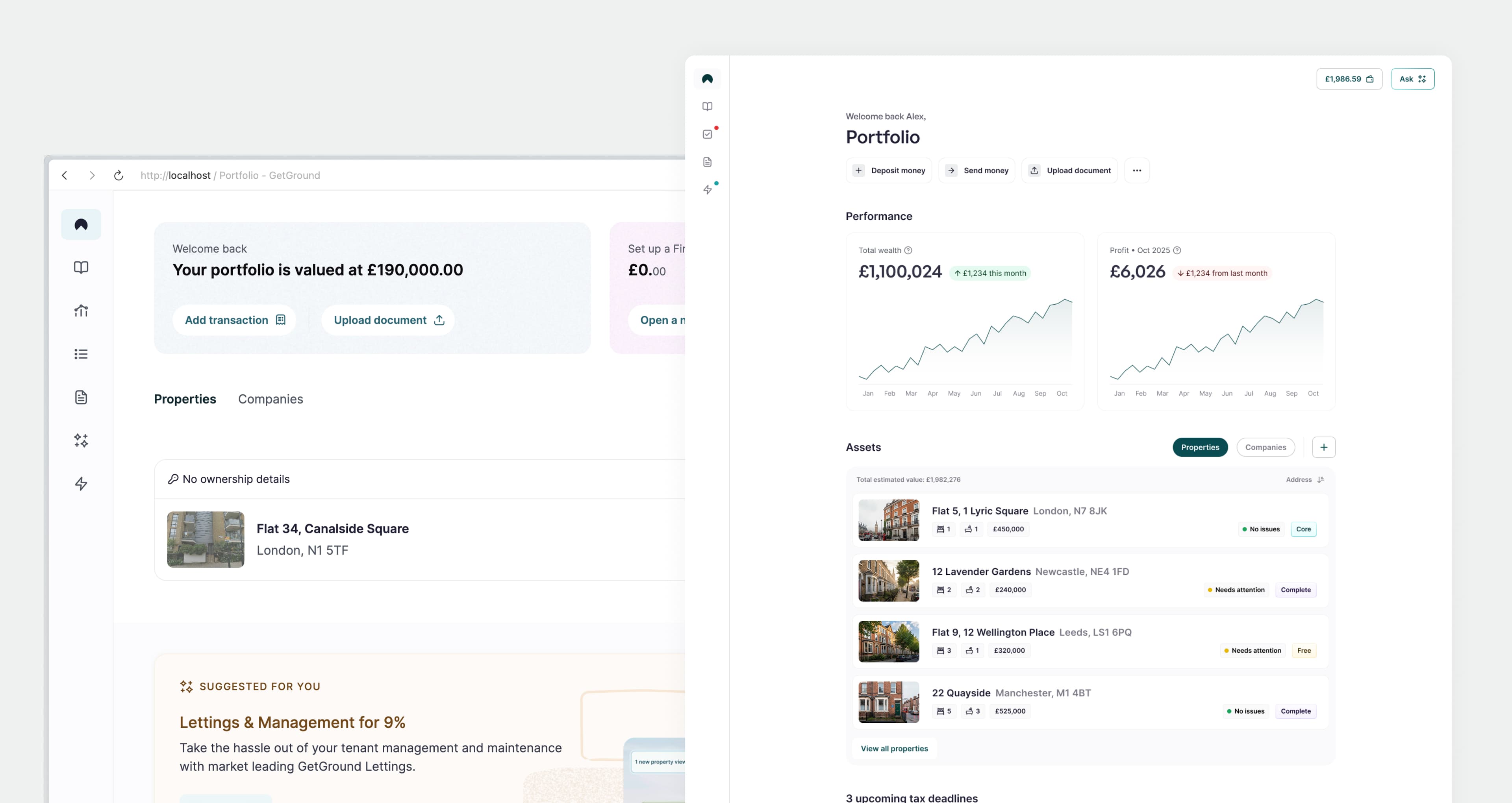
Portfolio
What's changed?
The portfolio page is where the user lands after logging in. It needs to direct the user to what they need, when they need it, and alert them of anything that may need their attention.
When rethinking the portfolio experience we asked users what was most important to them, looked at the data to understand current usage, and looked ahead in order to create a scalable experience. We found that the current quick actions were the most used elements of the screen, investment goals, and taxes were top of mind, and we needed to scale for the introduction of dynamic AI driven experiences.
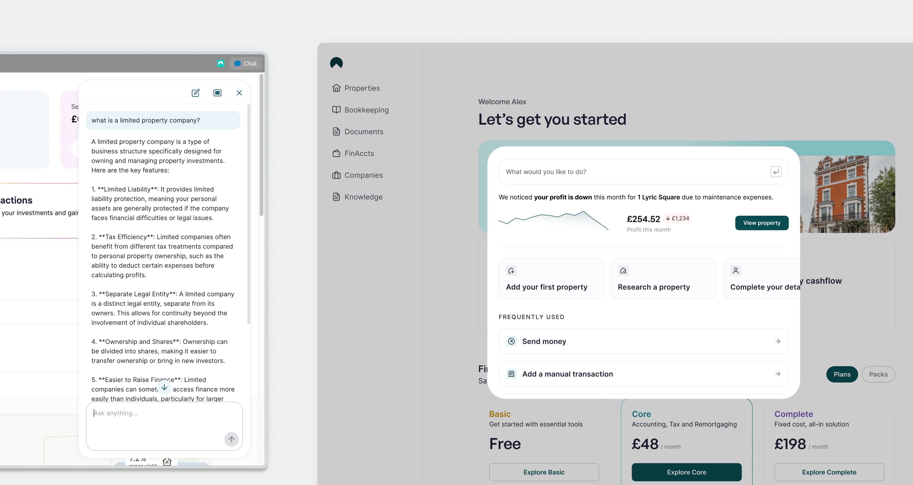
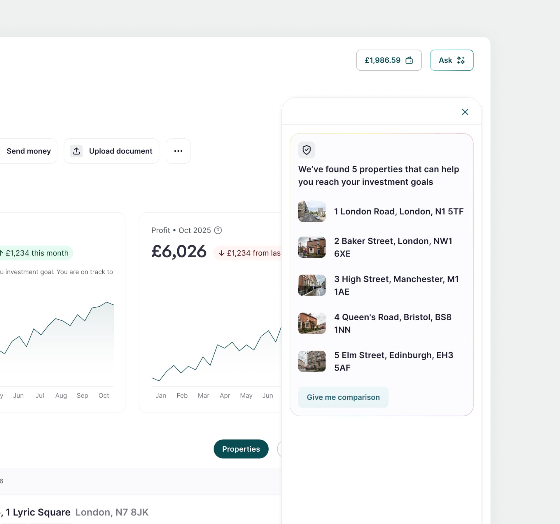
GetGround AI
What's changed?
The current AI experience is a simple chat where the user can ask about property investment, the services GetGround can provide, and perform basic tasks such as downloading a bank statement. As we weave AI into the foundations of the platform we need scalable and dynamic UI to allow for this.
We have therefore completely reimagined how AI surfaces in the platform, starting with simple patterns that can surface in context, dynamic UI, from the side panel within transactions, to model experience that generates actions and reports based on portfolio, market and user context.
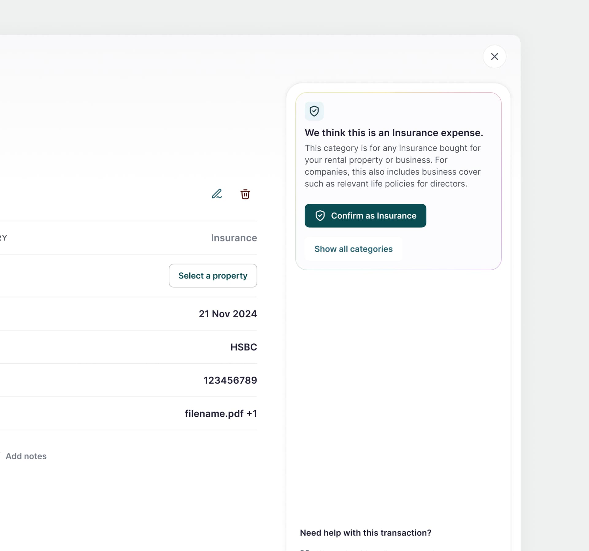
Transactions
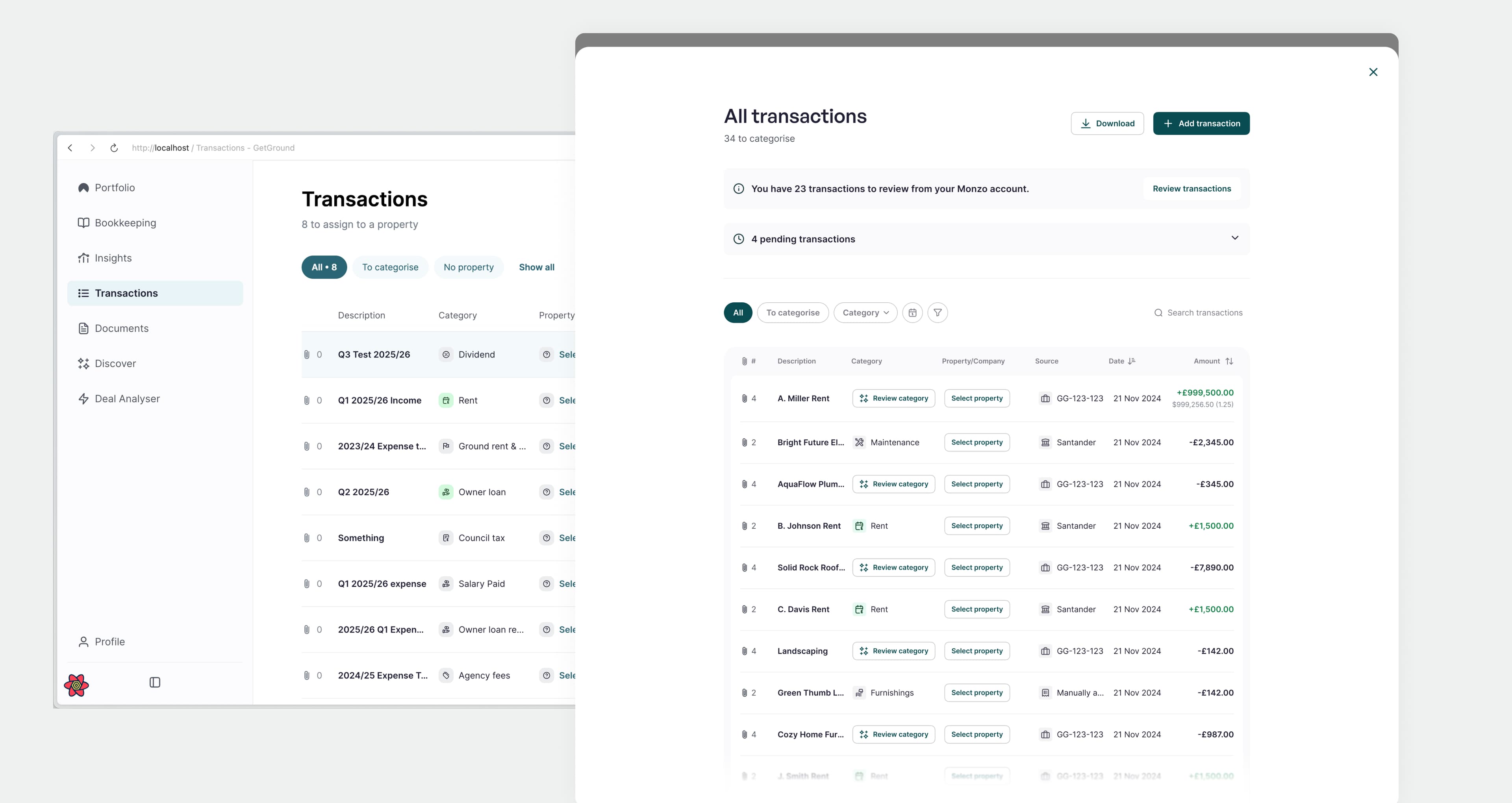
What's changed?
The transactions screen functionality was still relevant in the new world, however the feature needed updating to bring it in line with the rest of the platform. Subtle changes have been made to use the new design patterns and brand colours.
Property Details
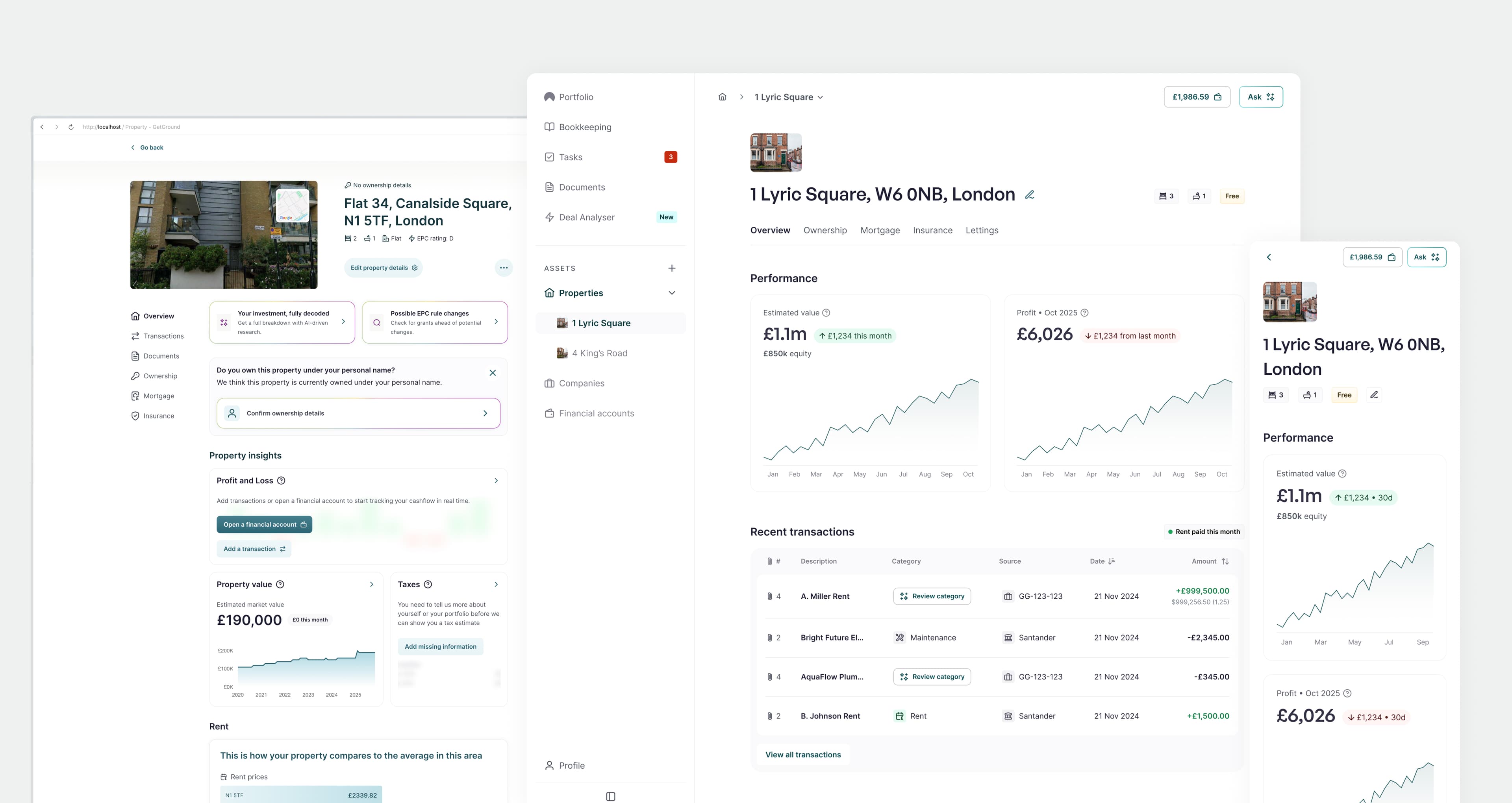
What's changed?
Property details is one of the most important pages in the platform, it is where the user can manage the day to day of their investment, understand performance, and understand their cashflow.
The previous iteration was overwhelmed with previous experiments, leading to a noisy and overwhelming experience. The refresh focussed on keeping what works, removing what was unnecessary, and creating a cleaner more deliberate interface.
Financial Accounts
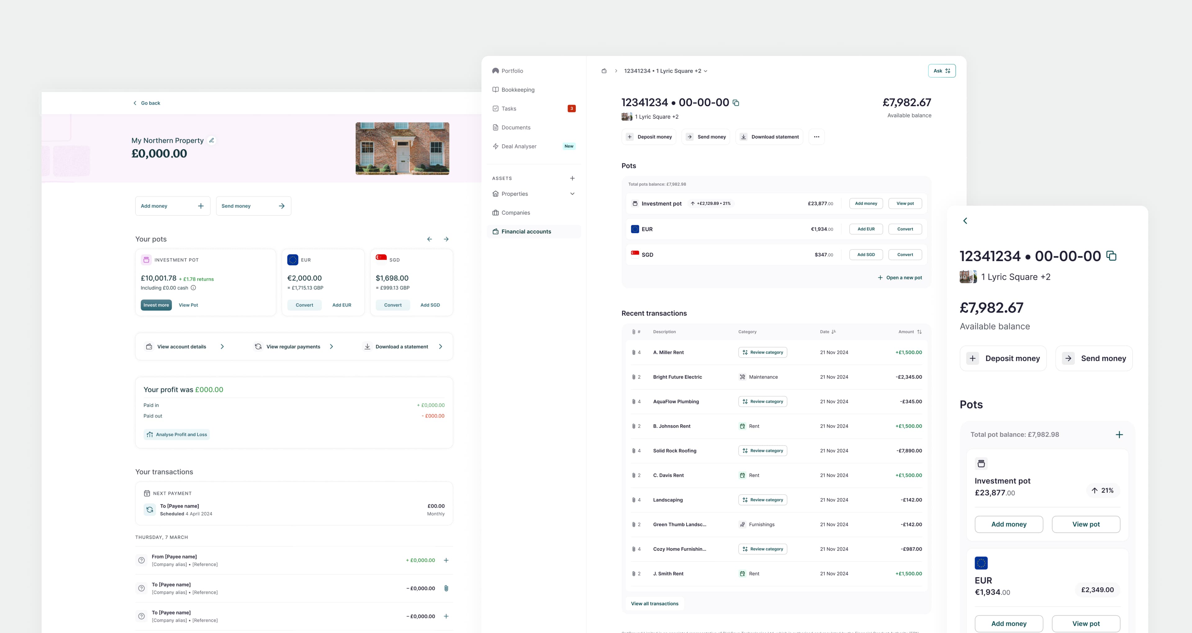
What's changed?
Other than the design of the financial account screen being out of date in terms of design, much of the functionality, such as seeing profit per account, was not relevant and even misleading.
User screen recordings and usage data showed that the financial account screen was used for frequent and specific actions such as depositing and sending money, and downloading statements, rather than viewing insights. The refresh therefore focussed on the utility of the screen, making actions clear and easy to find, and removing noise.