Loading...
Product led growth through intent-led onboarding
GetGround is a prop-tech SaaS democratising property ownership through financial management, lettings, mortgages, and portfolio optimisation for personal and limited company landlords.
Problem statement · Users were adding properties without enough context for GetGround to understand ownership type, buying stage, or mortgage opportunity. The redesign captured minimum useful details earlier, then routed users into clearer next steps.
Role · Lead Product Designer and Product Manager

Problem
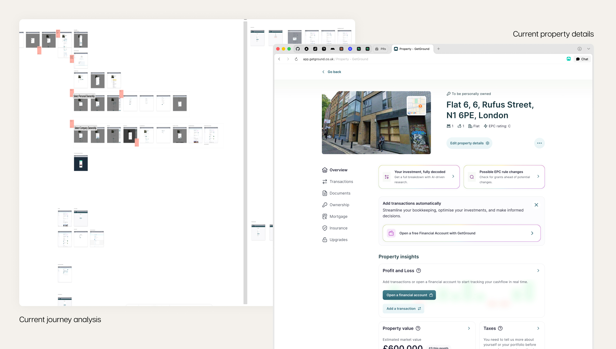
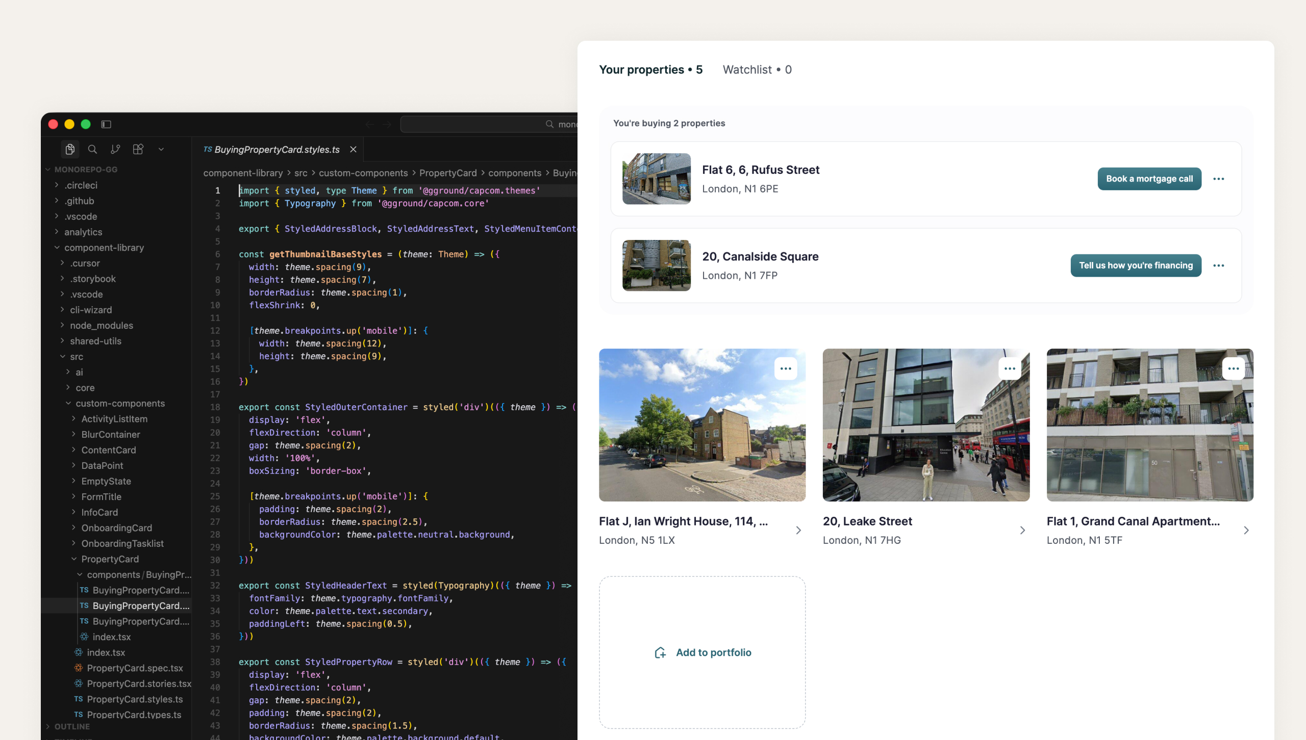
Users were adding an address, not a useful property profile
Landlords typically hold two or more properties; GetGround users averaged 1.7. Users added an address and stopped before sharing ownership type or investment stage, so the product could not personalise next steps or create product-led opportunities in mortgage, insurance, or lettings.
I analysed the onboarding journey and found two issues: no value exchange after adding a property, and cognitive overload on the property details screen with no clear onward journey.
Digging into the data
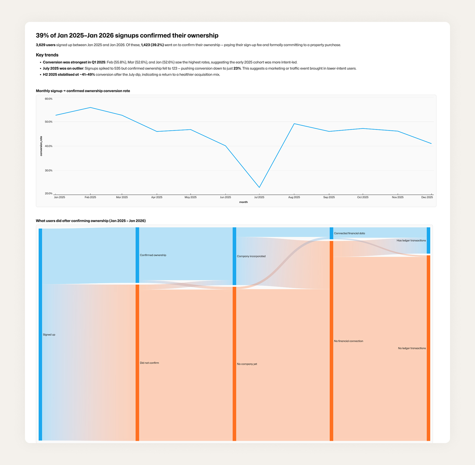
Between Jan 2025 and Jan 2026, only 39% of signups confirmed how they owned their property.
73% never confirmed ownership.
Of the 952 who confirmed, 95% incorporated a company, a required step.
Only 16.6% of confirmed users connected open banking or HMRC.
Just 142 users (3.9% of signups) completed all five journey stages.
Without property context, we cannot convert free users to paying users.
Rethinking adding a property
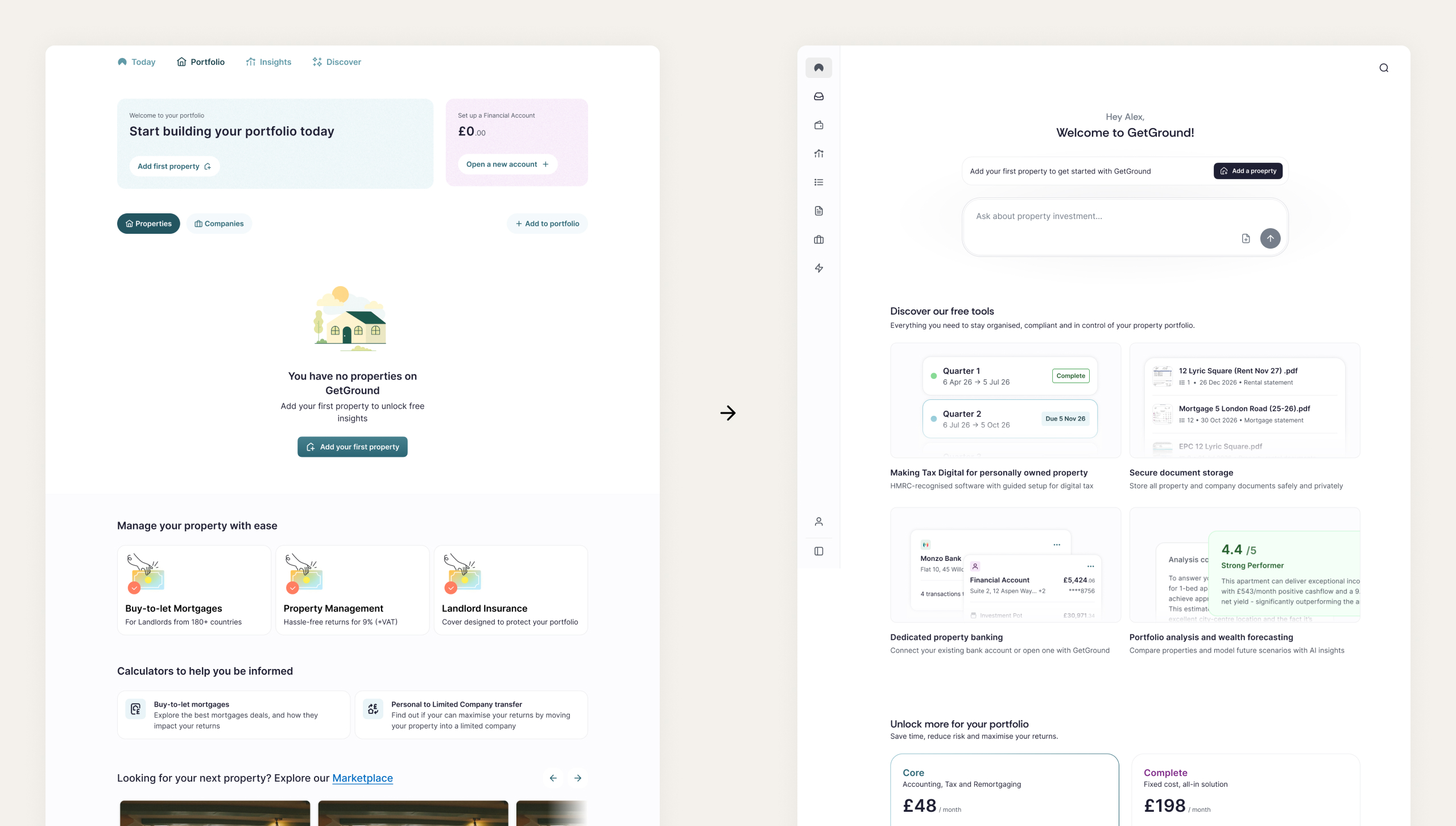
Creating an intent-led adding experience
The old empty portfolio flow treated every user the same and surfaced too many next steps. The redesign moved from adding an address to understanding property context: capture the minimum details to identify intent, then route users into clearer journeys based on investment stage and ownership type.
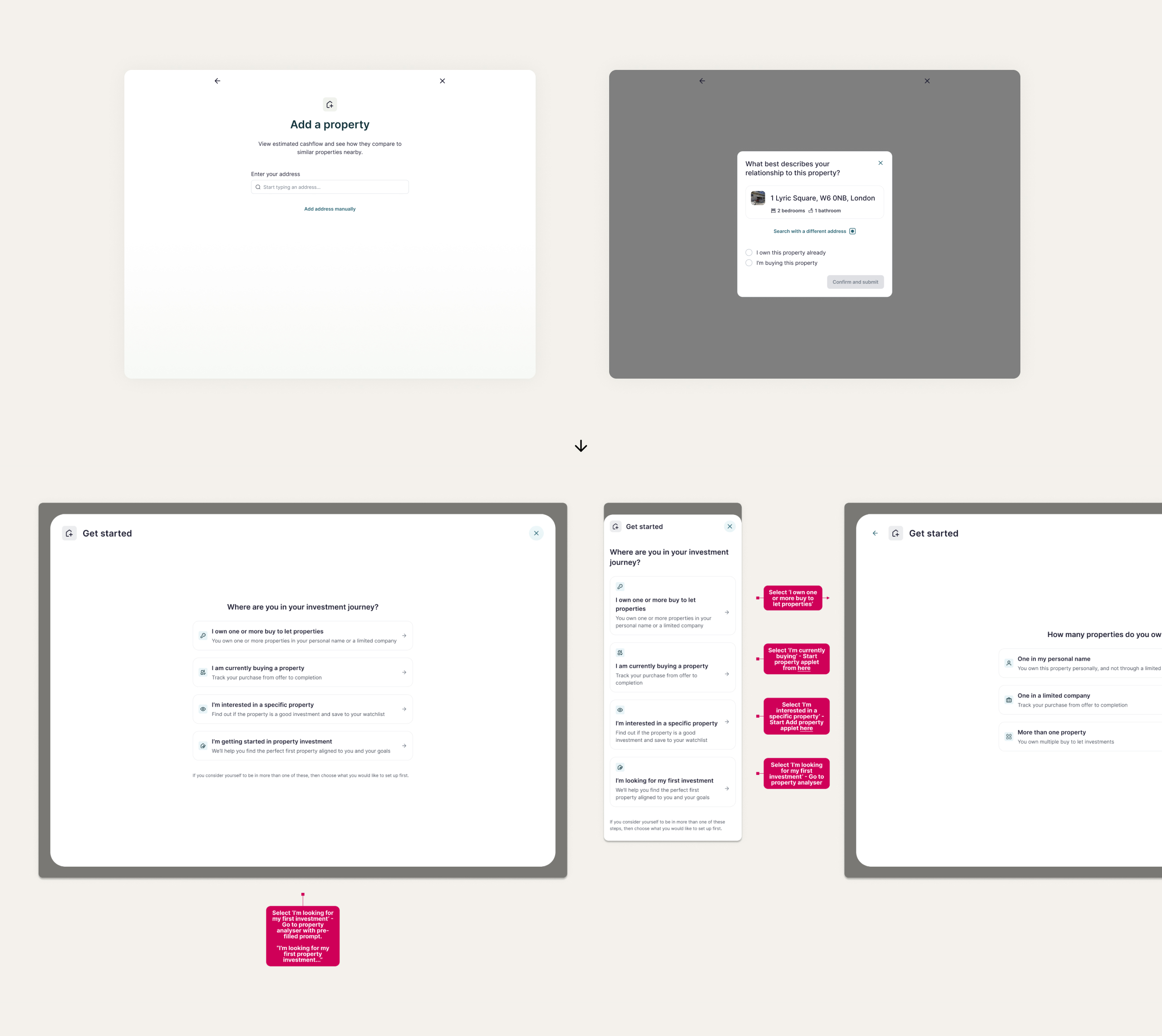
Gathering data in context
As a fast follow to the main engineering work, I shipped a data-gathering experiment for users adding a property they were buying: test whether they would add financing details, or book a call if not yet financed. This was the start of context-led follow-on journeys that create value for users and the business.
Impact
Properties per user increased by 30%
After a mid-March release, properties per user rose from 1.7 to 2.2.
Financial data connection rate increased by 100%
Financial data connections doubled: from 8% between Jan 2025 and Jan 2026 to 17.5% after March.
What's next
Experiment with the data we have
We will test what data matters most through in-product experiments: remortgage nudges, income and expense reviews, and insurance renewals. Once we know what captures users, we can build a more complete experience.
Encourage data gathering
We know which data points matter and how they map to jobs to be done, but we need to collect them better. Only 10% of properties have mortgage fixed-term end dates, a crucial input for mortgage services.